About Us
Jain Multispecialty Hospital stands as a beacon of excellence in healthcare, guided by a profound commitment to patient-centric care and clinical innovation. Founded with the vision of providing comprehensive and compassionate medical services, our hospital has emerged as a trusted healthcare institution dedicated to improving the lives of individuals and communities we serve.
Mission
At Jain Multispecialty Hospital, our mission is to provide exceptional healthcare services with compassion, integrity, and excellence. We are dedicated to improving the health and well-being of our patients by delivering personalized, high-quality care tailored to their unique needs. Through continuous innovation, collaboration, and community engagement, we strive to be a trusted healthcare partner committed to achieving positive health outcomes and enhancing the lives of individuals and communities we serve
Our Vision
Our vision at Jain Multispecialty Hospital is to be a leading healthcare institution recognized for our unwavering commitment to patient-centered care, clinical excellence, and innovation. We aspire to create a healing environment where every individual feels valued, respected, and empowered to achieve optimal health and wellness. By embracing the latest advancements in medical science, fostering a culture of compassion and inclusivity, and actively engaging with our community, we envision a healthier, happier future for all.
Our Values
- Excellence: We are dedicated to achieving excellence in every aspect of healthcare delivery, from clinical outcomes to patient experience.
- Compassion: We approach every interaction with kindness, empathy, and sensitivity, recognizing the unique needs and concerns of each individual.
- Integrity: We uphold the highest ethical standards and transparency in our practices, earning the trust and confidence of our patients, staff, and community.
- Collaboration: We believe in the power of teamwork and collaboration, working closely with patients, families, and interdisciplinary healthcare professionals to achieve optimal health outcomes.
Our Team
Our hospital is home to a diverse team of experienced and dedicated healthcare professionals, including board-certified physicians, skilled nurses, allied health professionals, and support staff. United by a shared commitment to excellence and patient care, our team brings together expertise from various specialties to provide comprehensive and personalized treatment solutions.
Community Engagement
As a responsible corporate citizen, Jain Multispecialty Hospital actively engages with the community through health education initiatives, wellness programs, and outreach activities. We believe in empowering individuals to take control of their health and well-being, promoting preventive healthcare practices and raising awareness about prevalent health issues.
Meet Our Directors
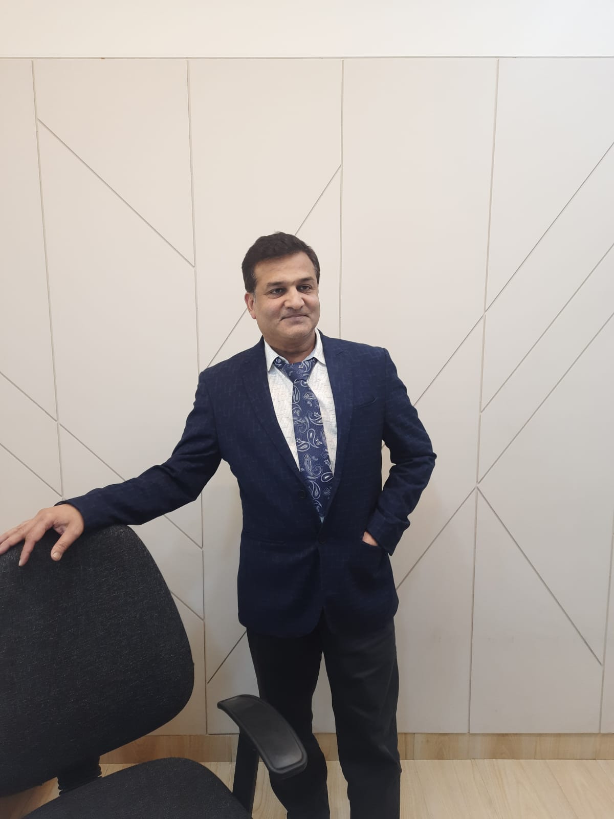
Dr. Vivek Jain
Dr. Vivek Jain is a renowned Consultant Orthopaedic Surgeon, specializing in the treatment of fractures, arthritis, back issues, knee pain, and bone diseases. As the Medical Director of Jain Multispecialty Hospital, Dr. Jain leads our team with unwavering dedication and expertise, ensuring that patients receive the highest quality of specialized care.
With over 20 years of experience in orthopaedic surgery, Dr. Jain has earned a reputation for excellence in his field. He is committed to staying abreast of the latest advancements in orthopaedics, allowing him to offer cutting-edge treatments and personalized care to each patient.
Dr. Jain’s expertise extends beyond surgical interventions. He believes in a holistic approach to patient care, emphasizing prevention, rehabilitation, and patient education. By combining his surgical skills with compassionate care, Dr. Jain strives to improve the quality of life for individuals suffering from orthopaedic conditions.
Under Dr. Jain’s leadership, Jain Multispecialty Hospital provides round-the-clock services to address orthopaedic emergencies and ensure timely access to care. His vision for the hospital is rooted in compassion, integrity, and excellence, guiding every aspect of patient care and operations.
Dr. Vivek Jain’s contributions to the field of orthopaedics extend beyond his clinical practice. He is actively involved in research, education, and community outreach programs aimed at promoting musculoskeletal health and raising awareness about orthopaedic conditions.
As a patient-centric facility, Jain Multispecialty Hospital is privileged to have Dr. Vivek Jain at the helm, leading our team of dedicated healthcare professionals in delivering compassionate, specialized care to our patients. With his leadership, expertise, and unwavering commitment to excellence, Dr. Jain continues to uphold our mission of providing comprehensive, patient-centered orthopaedic care.
We invite you to experience the difference of Dr. Vivek Jain’s expertise and the compassionate care provided at Jain Multispecialty Hospital. Your journey to improved orthopaedic health begins here.
Dr. Shruti Jain:
Dr. Shruti Jain, with her distinguished qualifications of D.A. M.B.B.S., serves as the Managing Director of Jain Multispecialty Hospital. Her expertise and leadership are instrumental in upholding the highest standards of healthcare excellence within our institution.
Dr. Shruti Jain’s academic background and professional experience reflect her unwavering commitment to the healthcare industry. With her extensive medical knowledge and management skills, she plays a pivotal role in overseeing the day-to-day operations of the hospital and ensuring that patients receive superior medical care.
As a qualified medical professional, Dr. Shruti Jain understands the importance of patient-centered care and strives to create an environment where patients feel valued, respected, and well-cared for. Her dedication to compassionate healthcare delivery is evident in every aspect of the hospital’s services.
Beyond her administrative responsibilities, Dr. Shruti Jain actively collaborates with medical professionals and staff to implement innovative healthcare solutions and enhance patient outcomes. She fosters a culture of continuous improvement, encouraging staff development and the adoption of best practices in healthcare delivery.
Dr. Shruti Jain’s vision for Jain Multispecialty Hospital encompasses not only clinical excellence but also a commitment to community engagement and social responsibility. Under her leadership, the hospital actively participates in community health initiatives and outreach programs, aiming to improve healthcare access and promote wellness in the region.
As Managing Director, Dr. Shruti Jain is dedicated to fostering a culture of excellence, integrity, and compassion throughout Jain Multispecialty Hospital. Her leadership ensures that our institution remains at the forefront of healthcare innovation, delivering exceptional medical services to our patients.
We invite you to experience the difference of Dr. Shruti Jain’s leadership and the compassionate care provided at Jain Multispecialty Hospital. Your health and well-being are our top priorities, and we are honored to serve you under Dr. Jain’s guidance.
Available Facilities

Modular Operation Theater

I.C.U.

PHARMACY

Digital X-Ray

Pathology

Physiotherapy

Semi Deluxe Room
General Ward

Deluxe Room
Address
Malwa Hosiery, 6/6/1/7, Ghatkarpar Marg, Freeganj, Madhav Nagar, Ujjain, Madhya Pradesh 456010
Call Us
0734-2525212
3576106
9977694094
Email Us
jainmultispecialtyhospital@gmail.com